
Showcase illustrations for historical models
This is the first project I have developed during my internship in Technische Universität Dresden.
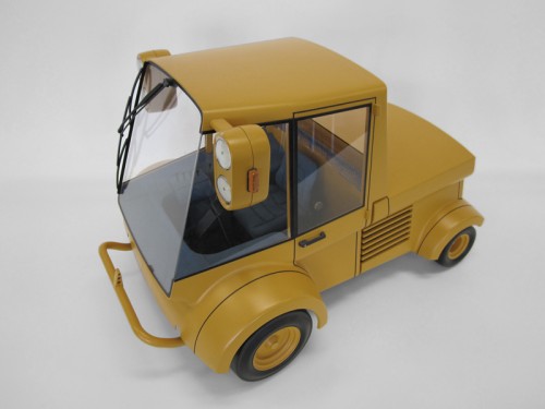
The main objective was making four big illustrations which would be background for the showcases where models from 1980´s and 1990´s will be exhibited. The size for the furniture background is 147 x 134 cm, each one with a main topic: Light, Mobility, Industry and Health.
We wanted the models to be shown in their way of using in an only scene where most of them take place. At the same time we wanted all the illustrations to look pretty similar, having the same colour, drawing and finishing style.
Our first step, of course was sketching. For that I took count of the objects to exhibit, by taking a look over them live or in photographs.
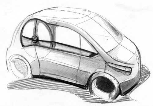
The first to start with was Light. I used a nearly realistic concept with a first quick sketch with Adobe Photoshop and a second attempt with a mix of traditional procedures, as watercolours and coloured pencils, and finished with Photoshop.
On the other hand I started another style path with a synthetic concept, using plain colours and clean lines with Adobe Illustrator.
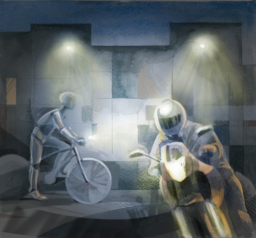
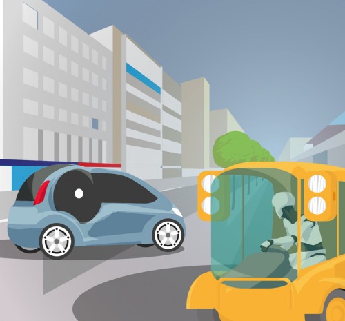
This was the first decision to make. What way to follow? We chose the synthetic one, because a realistic and colourful way could get over the models and we did not want that to happen. Our main objective was having the models exhibit and being protagonists.
Also the plain and clean concept fitted better with the idea of design. We decided to replace people with dummies, because all objects to show were prototypes or models and not goods ready to be sold. Having dummies made the idea of “project” more powerful.
Finally, all four illustrations were developed exactly the same way. The first step was to have a pencil sketch, or a few of them to scan. Using Adobe Illustrator we draw the sketch in a vector way in as many layers as we need to have the possibility of modifying them in the next steps.
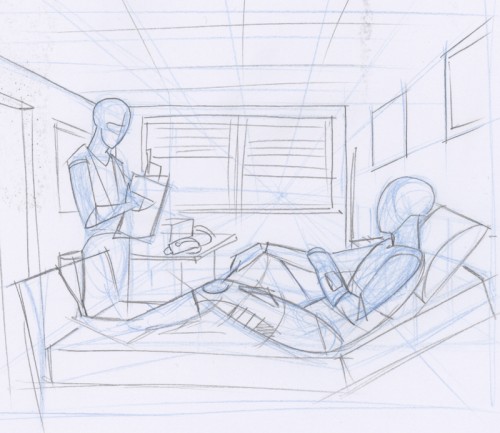
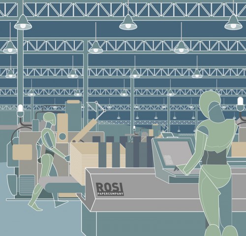
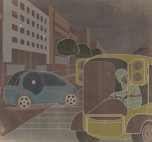
With Illustrator we finished the illustrations in a mix of plain colours and white lines in a variety of thickness. Finally we modified a little the colour range in Photoshop in order to have an older looking palette and added a new layer with an old paper transparency, which made the illustration look as it really was twenty or thirty years old.
– Alfonso Buendía –


