das visuelle zentrum der wissenschaftsbewertung
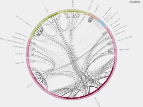
Wer kennt sie nicht die Zitation als Maßstab wissenschaftlicher Leistungsfähigkeit. hier ist mal anschaulich zu sehen, wer eigentlich wen in welchem Umfang zititert. Visuell anregend und überzeugend gemacht von Eigenfactor Project (data analysis) und Moritz Stefaner (visualization).
zu sehen unter: http://well-formed.eigenfactor.org
Visualization
This visualization gives an overview of the whole citation network. The colors represent the four main groups of journals, which are further subdivided into fields in the outer ring. The segments of the inner ring represent the individual journals, scaled by Eigenfactor™ Score. In the initial view, the top 1000 citation links are plotted. Line size and opacity represents connection strength. The Bezier curves follow the hierarchical cluster structure, using the hierarchical edge bundling technique (pdf). Selecting a single journal (inner ring) or whole field (outer ring) displays all citation flow coming in or out of the selection. The color is based on the cluster color of the origin node. Built with flare
Data set
We use a subset of the citation data from Thomson Reuters‘ Journal Citation Reports 1997–2005. The complete data aggregate, at the journal level, approximately 60,000,000 citations from more than 7000 journals over the past decade. For an interesting subset, we select journals ordered by their Article Influence™ in 2005, but include no more than 25 journals from a single field. To make the subset coherent, we make sure that selected journals are included all years and that we cover the 10 journals with highest Eigenfactor™ score. To cluster the networks, we use the information-theoretic method presented in Maps of information flow reveal community structure in complex networks (PNAS 105, 1118 (2008)), which can reveal regularities of information flow across directed and weighted networks.


